Light or Dark? Let Your Users Decide with Theme Toggles in Finxone Design Studio
Modern users expect modern experiences—and that includes the option to switch between light and dark themes. Whether it’s for accessibility, aesthetics, or just preference, offering theme flexibility is no longer a “nice to have”—it’s a UX standard.
With Finxone Design Studio, adding a theme switcher to your fintech application is not only possible, it’s effortless.
Multiple Themes, One Seamless Switch
The Design Studio allows app creators to build and preload multiple UI themes—from soft pastel palettes for daytime browsing to deep, high-contrast designs for night mode. Themes include:
Full colour palette adjustments for backgrounds, text, borders, and buttons
Changes in font styles, weights, and heading sizes
Custom input fields, loaders, and button shapes (square or rounded)
Styling for both light and dark modes across your entire app
Once your themes are ready, simply add the Theme Selector Widget to your application, choose the themes you want it to toggle between, and you’re good to go.
Built-In Toggle Logic That Just Works
Want to add a Dark Theme toggle to your settings page? Just drop it in, rename it to match your UI, and adjust the appearance of the switch to blend seamlessly with the rest of your interface.
Even better: Finxone lets you tether the theme toggle to the user’s device settings. That means if a user’s phone switches to night mode in the evening, your app automatically adjusts its look to match—without them needing to lift a finger.
Real-Time Theme Switching in Action
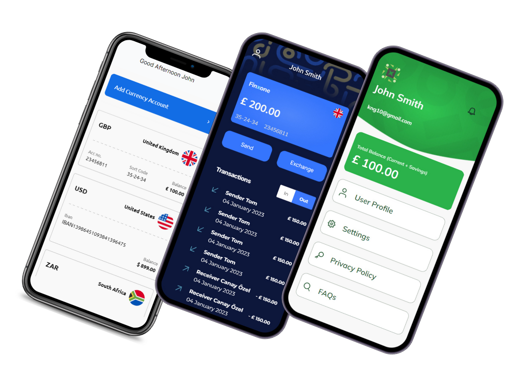
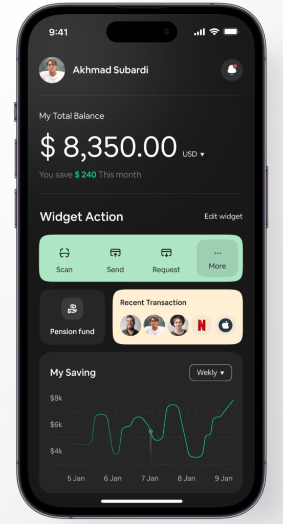
When the theme toggle is activated, your app’s entire UI updates instantly. No refreshes. No flickering. Just a smooth and responsive shift to the selected look and feel. Fonts, colours, buttons, and form fields all realign to the chosen theme—giving your app a premium, modern experience that feels natively polished.
Whether you’re building a personal finance tracker or a B2B banking portal, this feature lets you cater to a wide range of user preferences without duplicating design work.
Design Once.
Flex Everywhere.
With Finxone Design Studio, your design process becomes more powerful and user-focused. Supporting light and dark themes isn’t a bolt-on—it’s part of the foundation. And with tools like the Theme Selector Widget, delivering dynamic, personalised UI experiences has never been easier.
Log in to Finxone Design Studio today and give your users the power to switch up their style—day or night.
Tags :
Share This :
FIN x 1 Feature Posts
Finxone Design Studio
Finxone Design Studio enables you to design, build, and launch enterprise-grade financial applications with compliance built in from day one.